Have you ever finished a handmade card and wondered why it looks a bit flat or uninspiring? It’s not necessarily your stamps, inks, or talent that’s lacking. In this blog post, I will guide you through avoiding some common card-making mistakes and turning your creations from ordinary to extraordinary using the Pinkfresh Studio Good Times Plumeria Collection. With just a few small changes, you can elevate your card designs.
You can watch the detailed YouTube tutorial here. I’ve also included a complete list of the supplies that are currently available at the end of the blog post for your convenience:
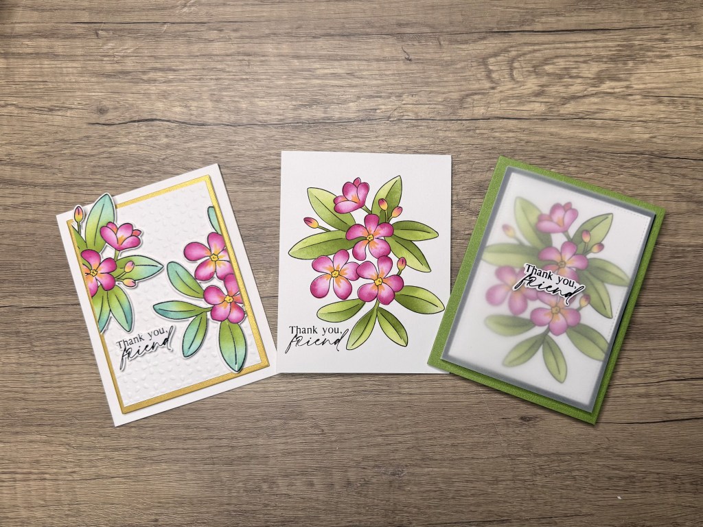
You can click on the thumbnails below to enlarge the image.
#1: Using the Wrong Cardstock
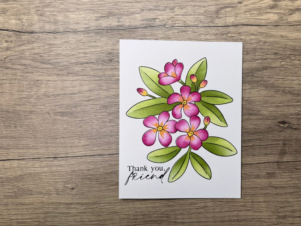
One of the foundational aspects of card making is your choice of card stock. If your cards sometimes look dull, reconsider the paper you’re using.
Using the same inks, stencils, and techniques, the distinction between Hammer Mill and Neenah Classic Crest Cardstock can be striking. The latter offers vibrant results that make colours pop.
#2: Sticking to Conventional Colour Palettes
Designers often default to conventional color palettes. By tweaking your color choices, you can dramatically change the energy of your card.
Experimenting with unexpected greens, muted tones, or warm tones rather than sticking to predictable colors can give your cards a whole new look.
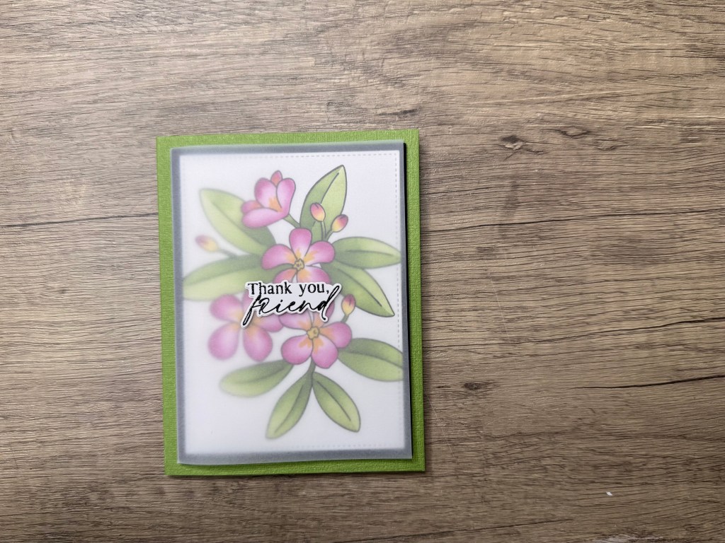
#3: Avoiding Coloured Card Bases
Many card makers frequently use white card bases, missing out on the impact coloured bases can have.
Trim your panel and mount it onto a coloured card base. This offers contrast and makes the design stand out beautifully.
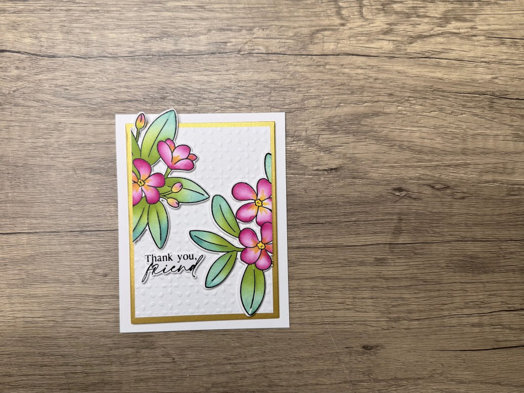
#4: Avoiding Layered Panels
Don’t underestimate the power of layers to create depth and dimension in your designs.
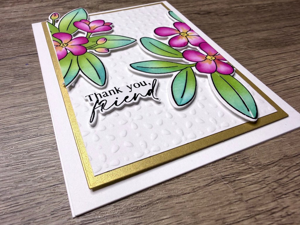
Use different card stocks or layering dies to create a polished edge and additional depth, like introducing a black or gold mat for contrast.
#5: Using a Flat Focal Point
Flattened focal points can leave designs feeling lacklustre.
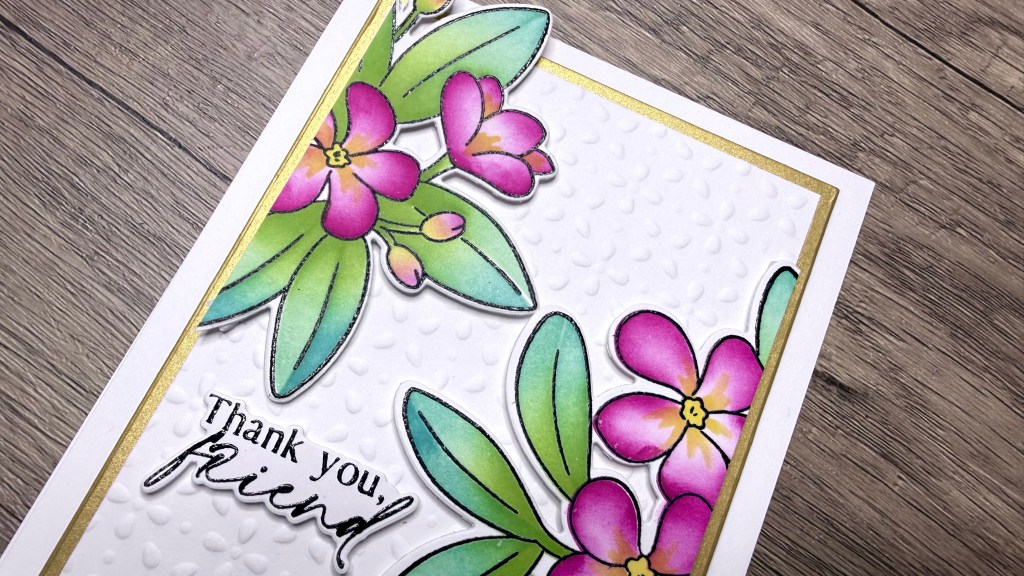
Elevate your focal point with dimensional foam tape to create shadow and depth, which enhances the perceived three-dimensionality of the card.
#6: Ignoring the Rule of Thirds
A principle borrowed from photography that can transform your card design is the Rule of Thirds.
Use a grid to place key elements at intersection points, thereby creating a more dynamic and engaging design.
#7: Not Adding Texture
Adding texture can instantly elevate a card’s appeal.
Emboss panels for a subtle or bold texture, depending on your design choice, to add sophistication without cluttering the design.
#8: Avoiding Creative Risks
Don’t be afraid to take creative risks with your designs.
By cutting into a patterned panel and reassembling in unexpected ways, you can add an artistic touch that sets your card apart. Try different cuts, angles, materials, etc. If something doesn’t turn out right, remember you can redo it because it’s only paper.
#9: Being Afraid to Use Vellum
Vellum offers a soft, elegant finish but is often underused due to fear of its complexity:
Use vellum as a full overlay or create a belly band. It diffuses the design while adding an element of surprise and elegance.
Recommendations
Improving your card making step-by-step involves refining your techniques and exploring new methods. Consider incorporating these principles with consistent practice and experimentation:
- Materials and Supplies: Visit your local craft store or check recommended online vendors for quality supplies that match the needs of each project.
- Online Tutorials: Engage with online crafting communities and tutorials to keep your skills updated and learn new techniques from fellow crafters.
You can download the printable PDF checklist here. No email necessary.
✂️ Want to craft along with me? Members get perks like monthly live Q&A sessions, badges, shout-outs, and Foiled Florals craft-along livestreams. Join the membership here: https://www.youtube.com/channel/UCDKhctb1ss7hbxVHivhT5YQ/join
Here is a list of all the crafting tools I use on a regular basis to create my card projects:


Leave a comment